Combine Machine Telemetry with Load Test Results in One Dashboard | LoadGen
Load tests tell you p95 went up. Machine telemetry tells you why. Build one dashboard over both — in LoadGen Analyse with AI, or in Grafana over the same InfluxDB.
LoadGen Engineering
Product Strategy
The measurement and the explanation usually live in two different tools. They don't have to. Here's how to put load-test results and machine telemetry on one canvas — in LoadGen Analyse, or in Grafana over the same data.
The two-tab problem
Every VDI capacity conversation ends the same way. The load test reports that logon time at 400 users is 38% slower than baseline. Somebody asks the obvious question:
"Is that the application, or did we just run out of CPU?"
And now you are in two tools. The test result is in the testing platform. The machine counters are in a monitoring tool, or a perfmon capture, or nowhere at all. The timestamps don't line up. The machine names don't match. By the time you've reconciled them, the change window has closed and the answer is "let's add another host to be safe."
That guess costs more than the licence.
Two kinds of machine data — and you want both
LoadGen collects machine-level data in two distinct ways. They answer different questions:
| SUT Monitoring (during a test) | LoadGen Insight (always on) | |
|---|---|---|
| When | Bound to a specific test run | Continuously, across the estate |
| What | Any Windows performance counter you choose — category, counter, instance — keyed by machine | Application usage (which app started, when, which version), CPU / memory / disk I/O, network connections and data usage, hardware inventory, installed Microsoft updates, WMI and registry inventory |
| Question it answers | "What did the infrastructure do while this test ran?" | "What does this estate normally look like — and what actually runs on it?" |
| Footprint | Counter collection during the run | Windows agent, roughly 1% CPU |
The point: SUT Monitoring gives you the test-window truth. Insight gives you the baseline the test window should be compared against — and the application reality that tells you whether your workload is even representative.
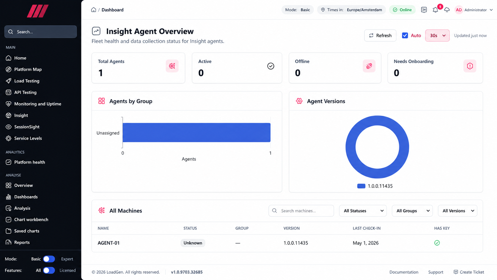 The Insight Agent Overview: KPI tiles (Total Agents, Active, Offline, Needs Onboarding), Agents by Group, Agent Versions, and the All Machines grid with status, group, version and last check-in.
It already starts in the score
You don't have to build anything to get the first version of this correlation. The LoadGen Score already contains an Infrastructure measure — sustained-CPU headroom per machine, taken from the counters bound to the test — sitting alongside Reliability, Responsiveness, Consistency and Trend.
So the very first run already answers a coarse version of the question: did the experience degrade while the platform still had headroom (application problem) or while it did not (capacity problem)?
The dashboard work below is how you go from that one-line verdict to the full picture.
Read next: How the LoadGen Score works
Option 1 — Build it in LoadGen Analyse
Analyse is the platform's own BI layer. It has four parts that matter here:
- Datasources — the InfluxDB / SQL / JSON connections dashboards draw from. Load-test results and Insight metrics both land in these stores, which is precisely why one dashboard can show both.
- Dashboards — grids of panels over any datasource; saved, shared and templated. Panels render as charts on your own data.
- Analysis — ad-hoc analytics operations: compare, trends, percentiles, distribution, correlation and more. Run one, preview it, then save it straight onto a dashboard.
- Chart workbench / Saved charts — for building and reusing a specific visual.
A dashboard that actually answers the question puts these panels side by side:
- Response time percentiles per transaction (from the run) — the symptom
- Concurrency over the run (from the run) — the load being applied
- Sustained CPU / memory / disk I/O per machine (from the counters and Insight) — the capacity
- A compare panel: this run vs baseline — the delta that started the conversation
- Application activity from Insight — what was actually running on those hosts at the time
Now "p95 went up 38%" and "the session hosts hit sustained 92% CPU from 310 users onward" are two panels on one screen, on one timeline. The conversation ends in minutes, with a number.
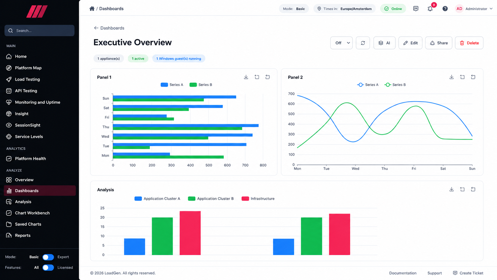 A live Analyse dashboard: chart panels plus an Analysis comparison panel plotting machine counters across two runs (baseline vs current), with AI, Edit, Share and auto-refresh in the toolbar.
The AI shortcut
Dashboards in Analyse carry an AI action, and the platform-health view carries an AI Dashboard Insights panel. Instead of reading five panels yourself, you can ask for the narrative — the AI reads the assembled context and answers in words.
Two honest caveats, because they matter:
- The AI narrates and analyses. It does not compute the numbers. Percentiles, comparisons and the Score are deterministic arithmetic; the AI is the layer that explains them.
- The provider is yours. LoadGen is multi-provider (OpenAI, Azure AI, Groq, Anthropic) and admin-configurable — bring your own key, and AI traffic leaves the appliance as outbound HTTPS to the provider you chose. If you don't configure one, everything else still works.
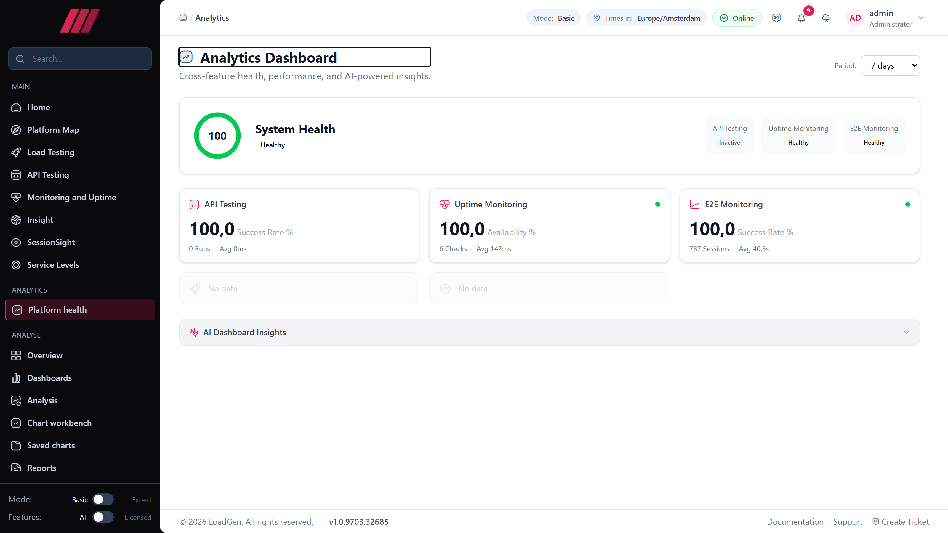 The cross-feature Analytics Dashboard: a 0–100 System Health score with per-feature cards (API Testing, Uptime Monitoring, E2E Monitoring — each with its own success/availability figure and volume) and the AI Dashboard Insights panel. Note the honest empty states: features with no data in the period say "No data" rather than inventing a green tick.
Worth knowing: this cross-feature health rollup covers Load Testing, E2E Monitoring, Uptime, API Testing and SessionSight. Insight has its own dashboard and enters the picture through the shared datasources described above — not through this health tile.
Option 2 — Do it in Grafana, over the same InfluxDB
If your team already lives in Grafana, you do not have to move.
The appliance ships Grafana, reverse-proxied at /grafana/ and reading the same InfluxDB the platform writes to on port 8086. Load-test metric streams, Insight process and system metrics, uptime probe results and E2E monitoring measurements are all in there. Grafana dashboards are also embedded back into the LoadGen front end, so you can keep one visual language across both.
Choose Analyse when you want run-aware operations — compare this run against that baseline, percentiles per measurement, one-click report — because those understand what a "run" is.
Choose Grafana when you want free-form time-series exploration, or you're merging LoadGen data with panels your team already maintains.
Most teams end up using both: Analyse for the test verdict and the report, Grafana for the wall screen.
What this changes
| Before | After |
|---|---|
| "p95 is up, probably capacity" | "p95 is up 38% from 310 users, while CPU sustained 92% on four of six hosts" |
| Two tools, two timelines, manual reconciliation | One dashboard, one timeline, one export |
| Capacity added "to be safe" | Capacity added because the curve says where it breaks |
The test tells you what happened. The telemetry tells you why. Putting them on one canvas is the difference between a finding and a decision.
Put the measurement and the explanation on one screen
Run a load test, bind the counters that matter, and build the dashboard once — in Analyse or in Grafana. Every later run drops straight into it.
Related reads
Keep reading.
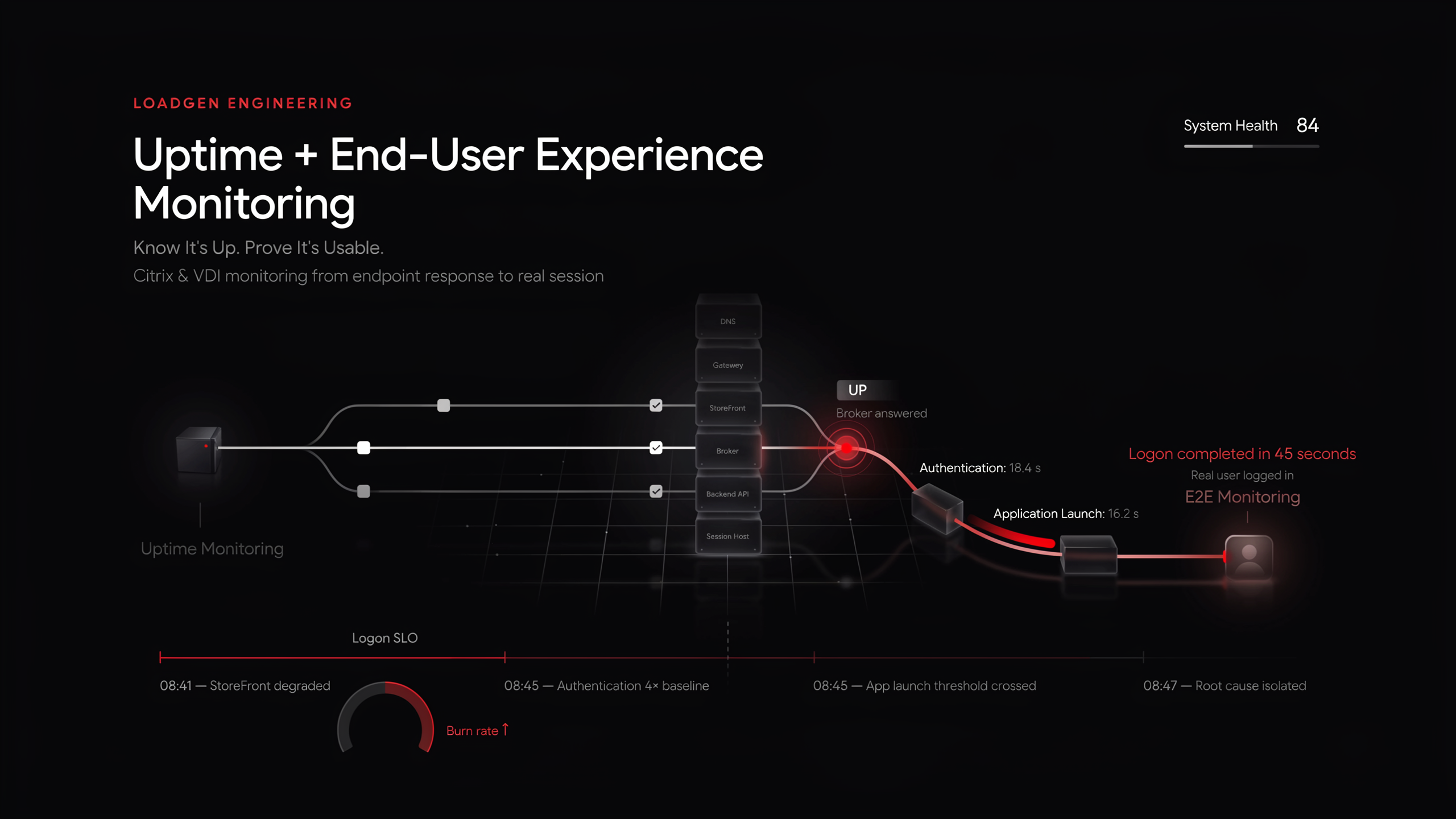
Uptime Monitoring + End-User Experience Monitoring for Citrix & VDI | LoadGen
Uptime says the broker answered. End-to-end monitoring says a real user logged in — in 45 seconds. Why VDI needs both, and how to run them on one platform.
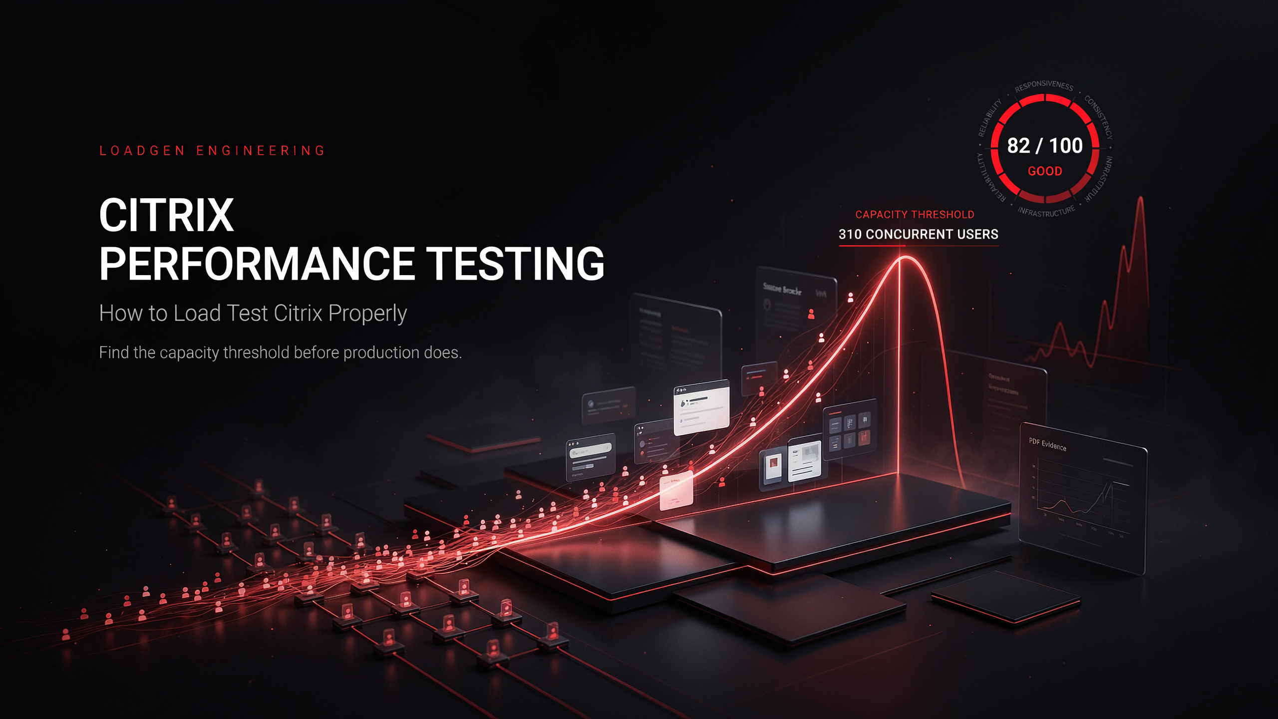
Citrix Performance Testing — How to Load Test Citrix Properly | LoadGen
How to load test Citrix: what to simulate, how to ramp, what to measure, and how to turn a run into a defensible "how many users fit" answer.
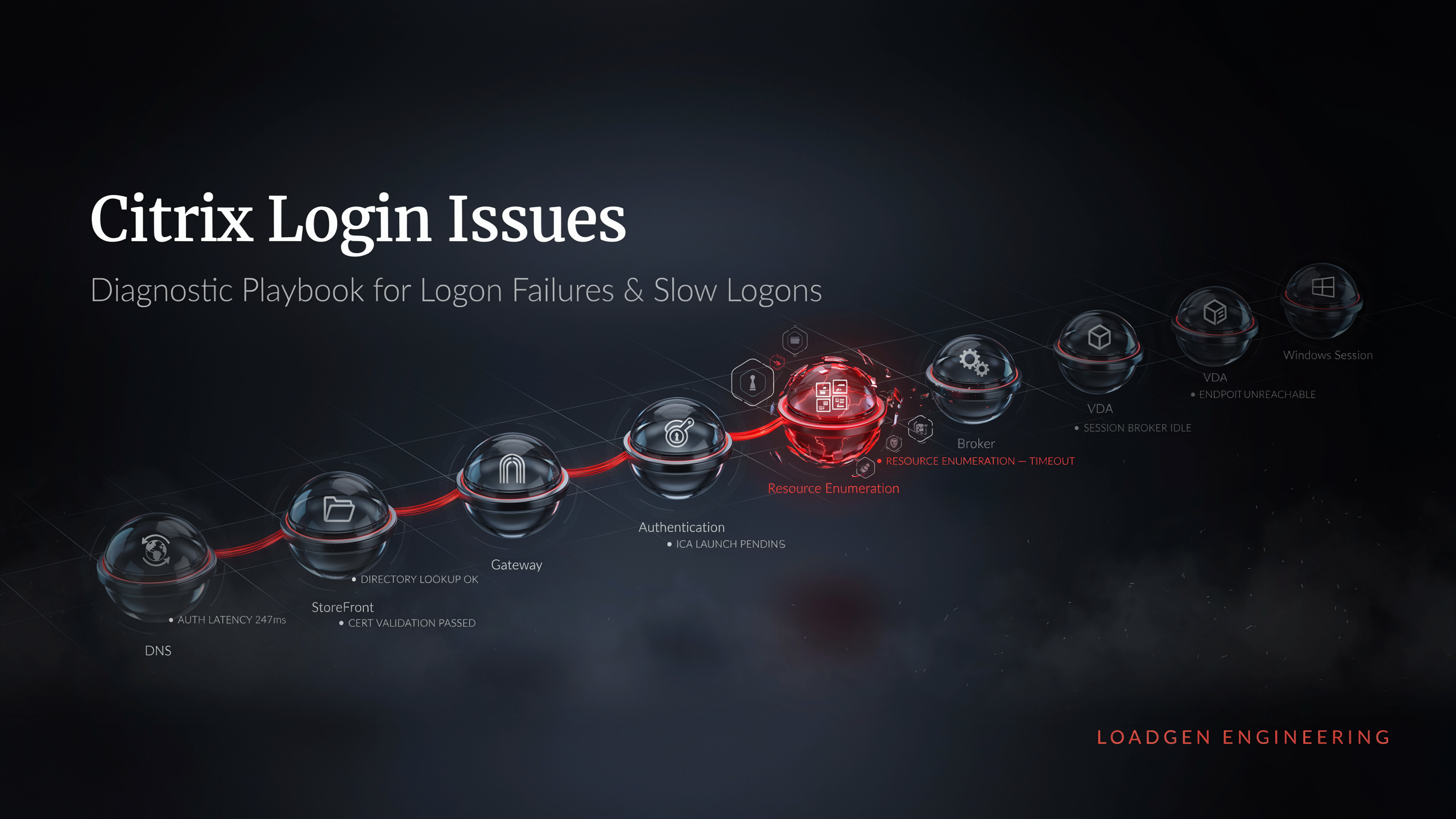
Citrix Login Issues — Diagnostic Playbook for Logon Failures & Slow Logons | LoadGen
Citrix not loading, logon failures, "failed to launch due to resource enumeration"? Work the logon chain step by step — and monitor it so you see the next one first.
Ready to baseline your environment?
Run the wizard, hit the cockpit, watch the audit trail build itself.
